How many hours do your employees spend doing basic analysis and making charts in Excel? If you’re like most companies, probably too many… and that’s what our Explorer version is here to fix. We give you multiple different tools to explore and understand your data all at the click of a button, so you don’t have to make charts or use =AVERAGE() ever again. We’ve even taken things a step further and can walk you through exploration with our novel Guided Business Intelligence™ methodology. You tell us what variable you’re trying to understand, and we’ll do the rest for you. We select the best way to visualize the data and build the charts. We crunch the numbers and do the statistical analysis. We even figure out what’s important and what isn’t so you don’t waste your time looking at things that are irrelevant. Oh yeah, and our “Quick Deck” export will package and export a PowerPoint about your variable of interest with a single click.
Explorer in Action
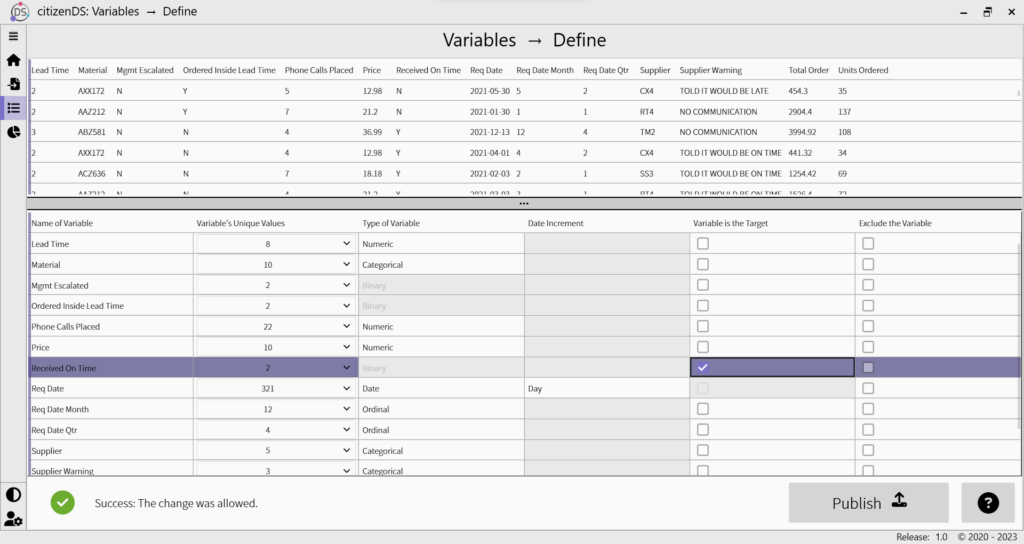
Upload Data
It all starts here! Just as a hot FYI, CitizenDS Explorer never sends your uploaded data anywhere. The data you upload into CitizenDS stays entirely on the machine from which you uploaded it, so you don’t have to worry about data security or governance issues (well, at least not from CitizenDS, anyways). We’re not transmitting your data over your Wi-Fi, nor are we sending your data to some cloud server in a random desert. It’s your data, not ours, and we value your privacy.
The Explorer version can upload data in the following forms:
.CSV, .XLS, .XLSX, .XLSB, .XLSM, .TXT, .TAB
You are allowed to upload up to 30 columns and 100K rows of data.
Quick side note, for the current version of Explorer, we convert any datetime variables into dates… we’ll be adding this capability in the future 🙂
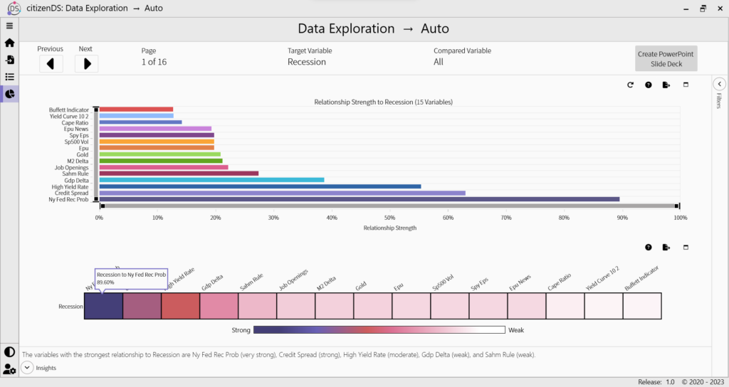
Auto Explorer
This is where the magic of guided business intelligence happens, and we’re incredibly excited to share it with you. All those questions and charts you normally ask your analysts to make for you? Yeah, we’ll take care of that. We provide you with a breakdown of what’s important and what isn’t, and then we show you (in order of importance) how your target compares to each of the most relevant variables. You’ll see the data visualized in the best forms to understand the trends and relationships as well as relevant statistics. And one more thing… Got a meeting in 5 minutes and need to present your findings? No problem – just export the “Quick Deck” out of the Auto Explorer and you’re good to go! It’ll generate a PowerPoint with all of the key findings and make you look like a data superstar.
Single Variable Explorer
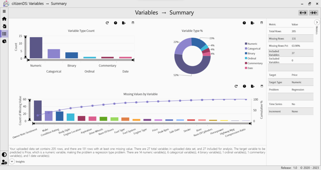
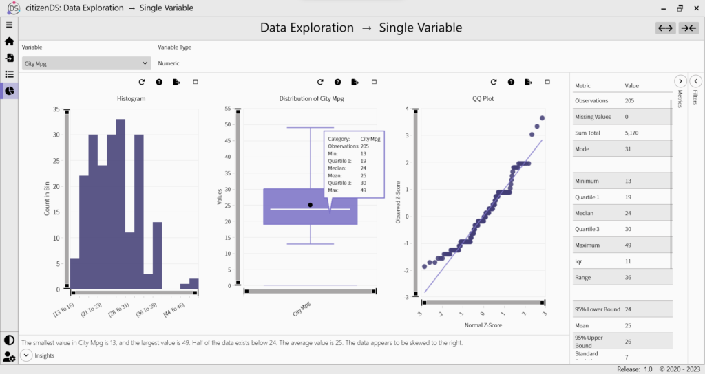
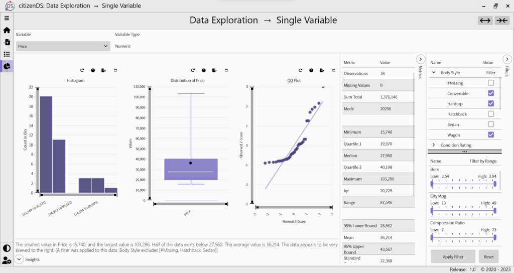
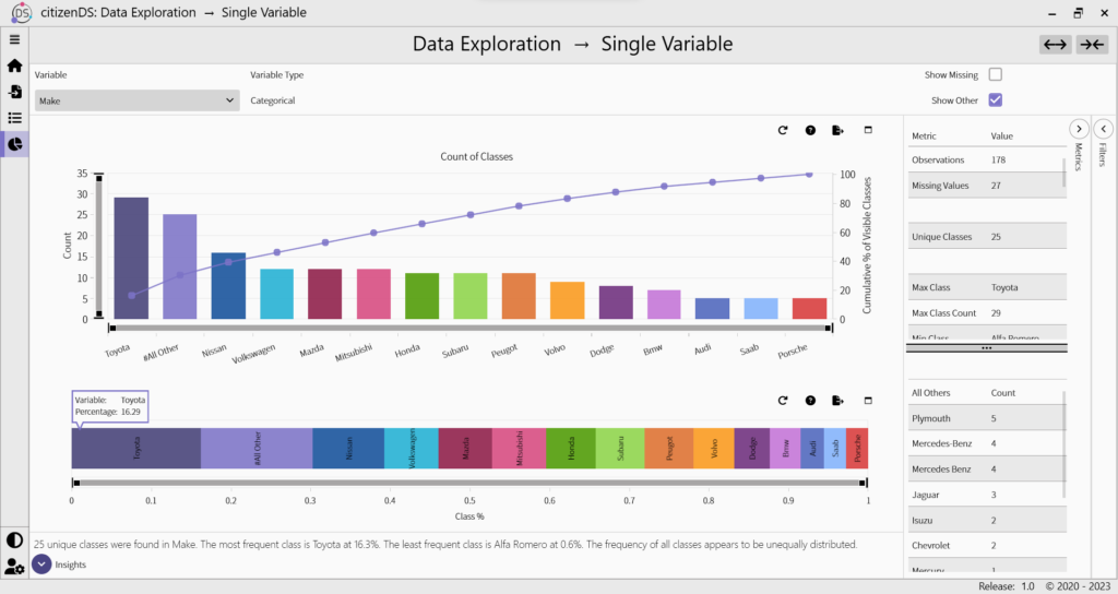
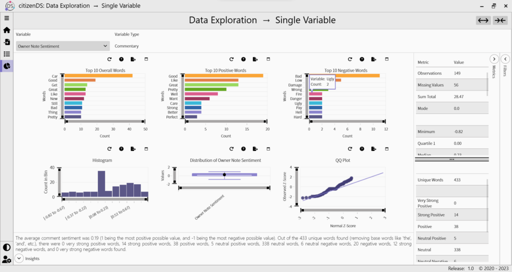
While double dates are fun, you don’t really get to know the person until you get to spend a little one-on-one time with them… and that’s the concept behind this section. The Single Variable Explorer allows you to look at one variable by itself to learn what makes it tick: What unique categories make up your variable, and how many are there of each? What’s the average of your variable? How are the values distributed in your variable? What’s your variable’s dream vacation spot? Before you take your data home to mom, you probably want to spend a little time in this section.
Double Variable Explorer
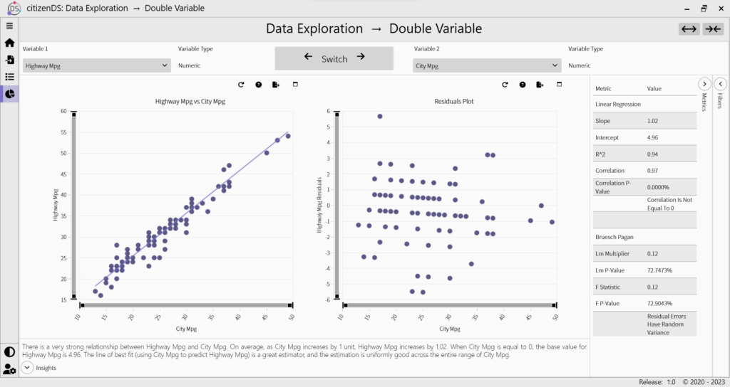
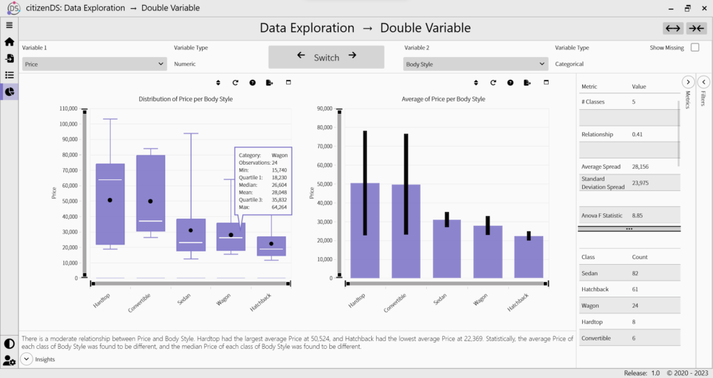
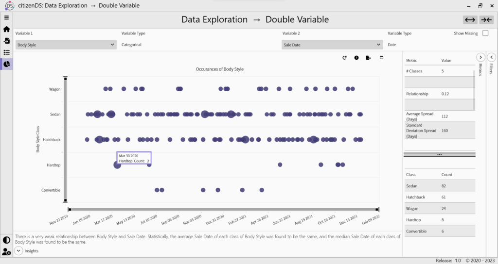
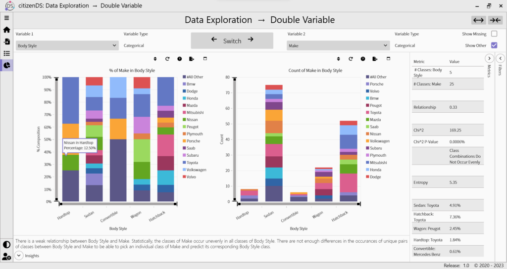
In this section, you’ll be able to pair any two variables together to see how they interact… it’s like that one time you tried pairing your two single friends together, but far less awkward. You’ll be able to see any trend or pattern that may exist, as well as get a statistical analysis of your input combination. If you want to really understand what’s driving your target variable, you’re going to want to play around in this section.
Relationships
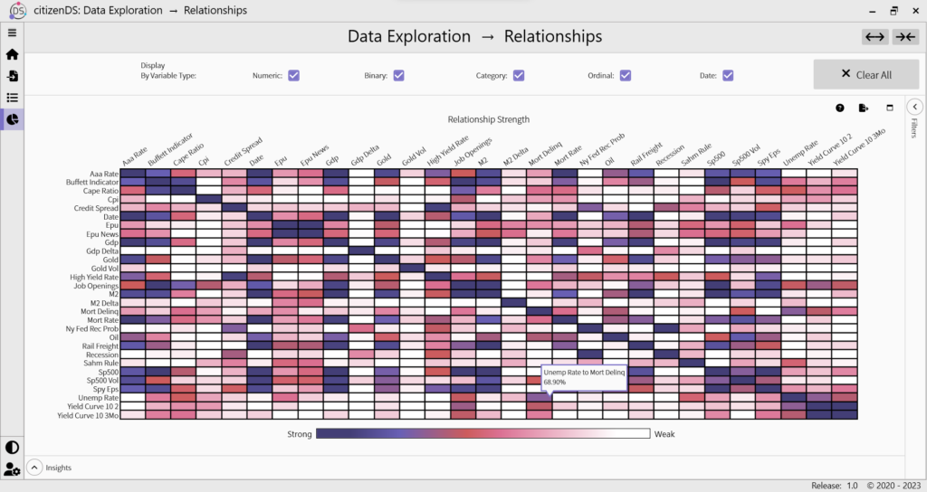
If you want to understand the big picture of your entire data set, you’ll want to check out the Relationships section. We figure out how strongly every variable in your data set relates to every other variable and present you with a super easy-to-interpret heatmap. This section may end up surprising you – you may learn that things you assumed were related aren’t and vice versa. It’s like one of those DNA tests where your mom always told you growing up that you were Kryptonian only to find out you’re actually Atlantean…but at least the whole being able to talk to fish thing makes sense now.
Target Relationships
Whether you totally forgot to do that analysis your boss needed to have by noon and it’s now 11:57 or you just have the attention span of a hamster, we’ll give you the skinny on what’s important about your target variable. You’ll quickly be able to see what is and isn’t worth investigating further, so you don’t waste your time mining useless data. Confidently tell your boss that you have a hunch that variables X, Y, and Z are key drivers of your variable of interest… now if you can only get to that conference room on time for the meeting.
Dynamic Explorer
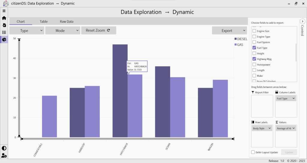
While the other sections in the Explorer provide you with tons of useful information, we know we can’t answer EVERY question you may have… and that’s why we’ve included the Dynamic Explorer. For those pivot table fans out there, this one is for you. You can visualize your data any way you want with this tool by simply dragging and dropping. You can also aggregate and group your data to better make sense of what’s going on under the hood. Sometimes, it’s fun to color outside the lines.

